2020
Etna Pasticceria Graniteria
Entrant Company
Raineri Design srl
Category
Corporate Identity - Corporate Identity / Other
Client's Name
Etna Pasticceria Graniteria
Country / Region
Italy
Etna Pasticceria Graniteria is a confectionery shop in the centre of Brescia.
Strong point of this patisserie is the ability of transmitting the culture, the flavours and aromas of Sicily in a city of northern Italy thanks to traditional products and cuisine and the experiences enjoyed by clients in this sales point.
At the beginning of 2017 Etna Pasticceria Graniteria changed ownership but attention is still focused on the accurate selection of raw materials, the same passion is dedicated to the preparation of both sweet and savoury specialities whilst a new approach has been given to communication.
To mark this change in management, the shop underwent restyling both inside the premises and in the use of online tools (facebook).
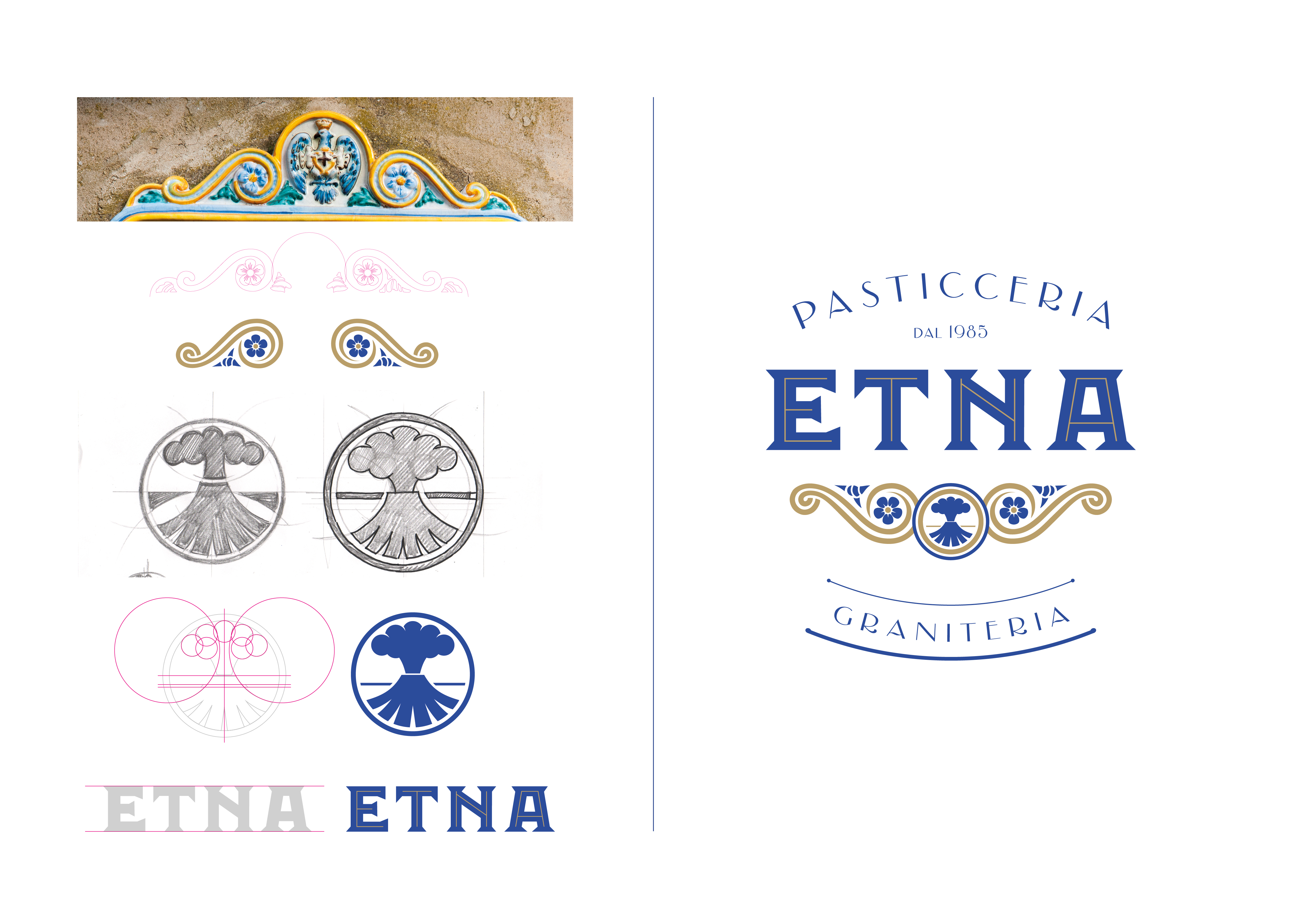
First of all, we worked on the logo: the colours chosen, tones intended to delineate the mood of the coordinated image and online communication, were blue, gold and white, colours which, in people’s imagination, immediately conjure up the natural splendours of Sicily.
The logo was designed and produced using two different fonts: “ETNA” was presented in a gracious font composed of the two main colours (gold and blue). Other parts of the text describing activities (confectionery, granita water ices and 1985) were written in sans serif.
Another element recalling Sicily is the stylised volcano inserted in the logo.
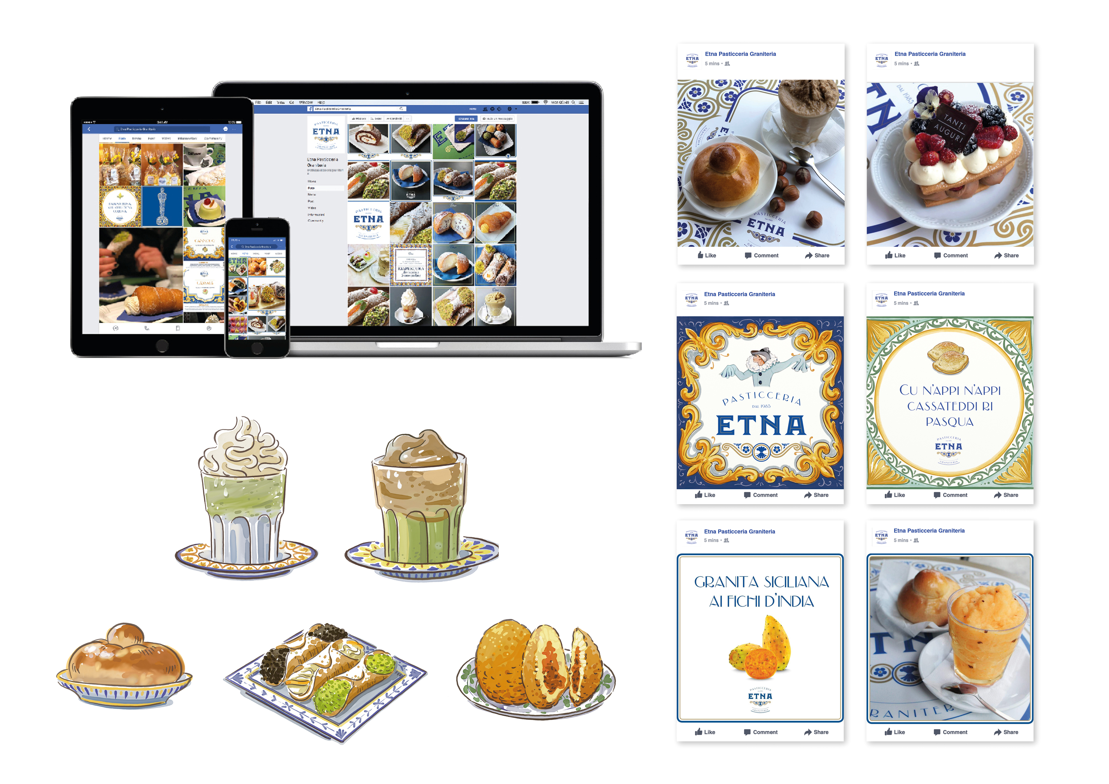
For both in-house and online communication, several ad hoc illustrations were created representing typical Sicilian delicacies (granita, cannoli, “tuppo” brioches (similar in form to French brioches), zeppole (giant choux puffs), and rollò (similar to English sausage rolls)). The same style was used to create a map of the city with landmarks making it easy to locate the shop.
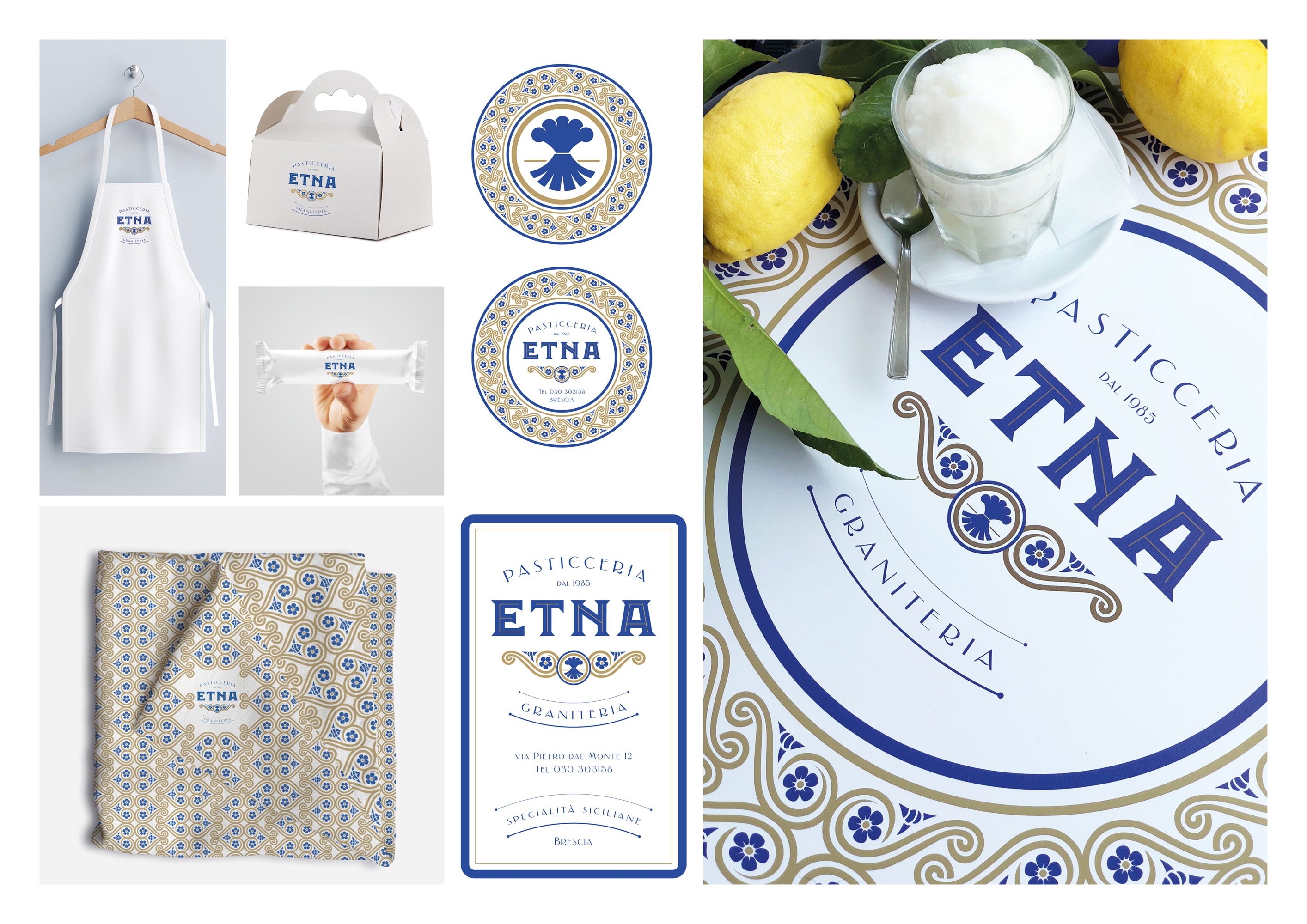
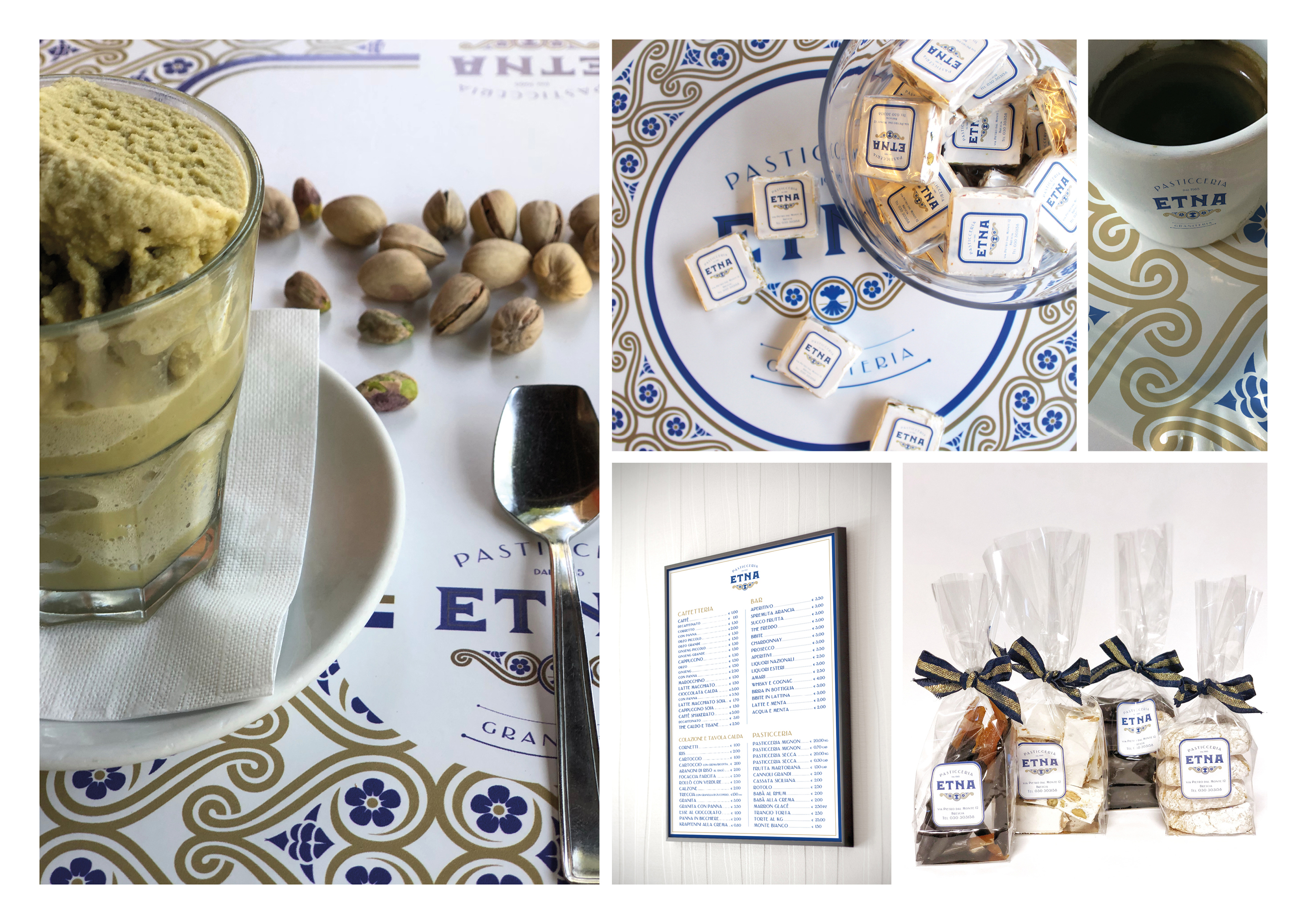
The textures used for both offline and online communication recall majolica, designed using colours to match those used for the logo.
After restyling the logo, production continued with new menus, panels, signs, business cards, uniforms and packaging materials.
The illustrations were printed on decorative panels and displayed in the sales point, as well as used in the editorial plan appearing on social media.

Entrant Company
Vitamin London
Category
Mobile App - Marketplace
Country / Region
United Kingdom

Entrant Company
Senses Residential and Day Care for Special Needs
Category
Corporate Social Responsibility - Pro Bono (Free)
Country / Region
United Arab Emirates

Entrant Company
System Era Softworks
Category
Experiential & Immersive - Promotions & Stunts
Country / Region
United States


Entrant Company
Magnetic Creative
Category
Corporate Identity - Logos
Country / Region
South Africa
