
2026
Bombay Sapphire
Entrant
Knockout Design
Category
Corporate Identity - Brand Identity
Client's Name
Bacardi Limited
Country / Region
United Kingdom
Gallery

About The Entry
Project description
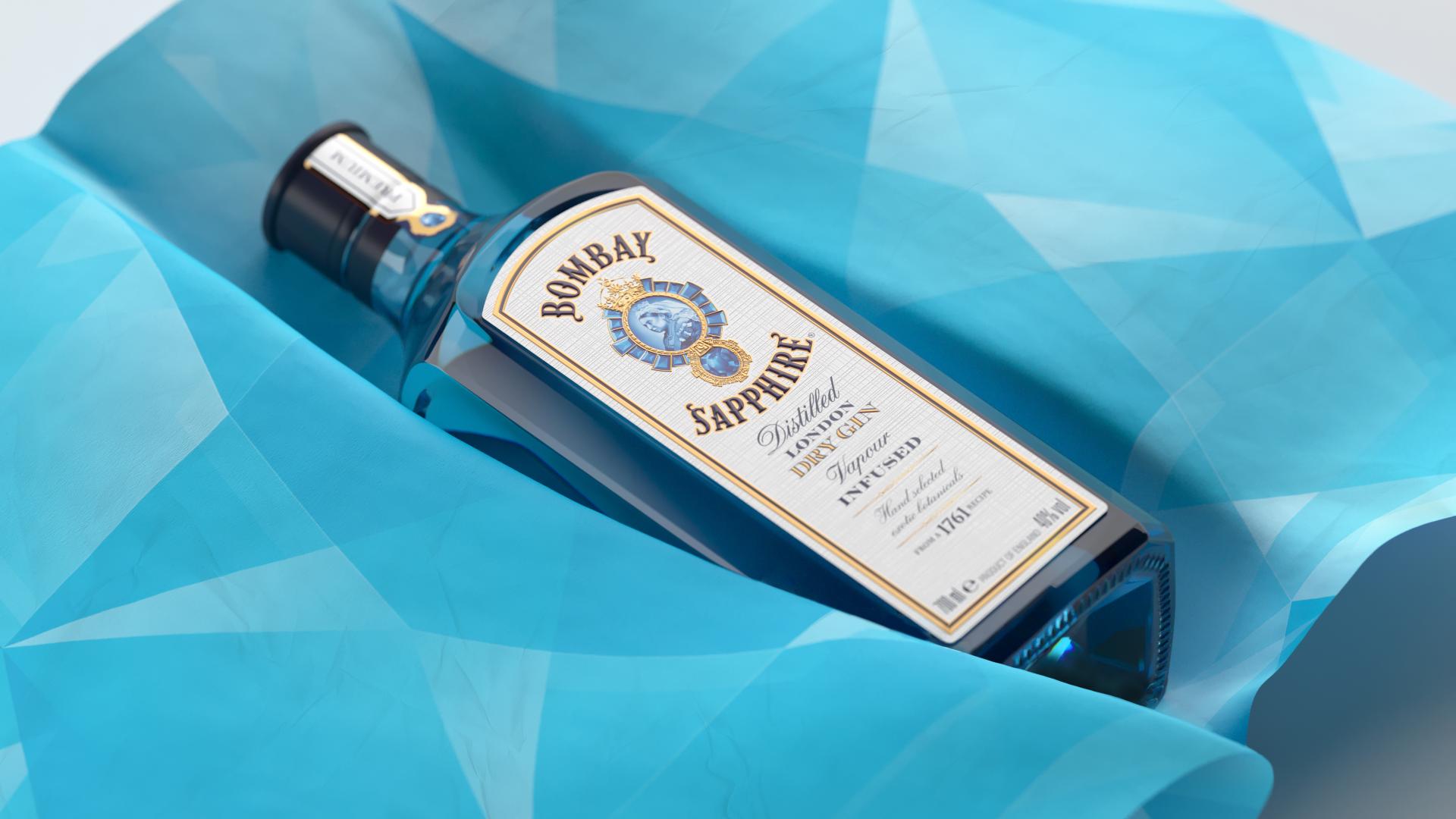
The Bombay Sapphire bottle is already one of the brand’s most distinctive visual cues. We partnered with Bombay Sapphire to refresh its global visual identity, propelling the brand into a bold new era.
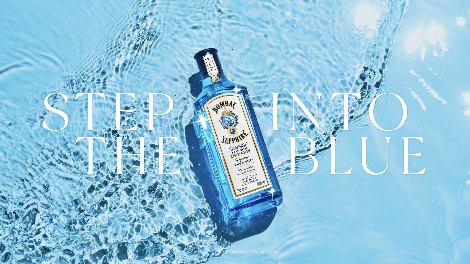
Our goal was to amplify the brand’s signature blue to create a brand world as iconic as the bottle itself, celebrating Bombay Sapphire’s rich heritage with a forward-thinking vision.
Creative intent
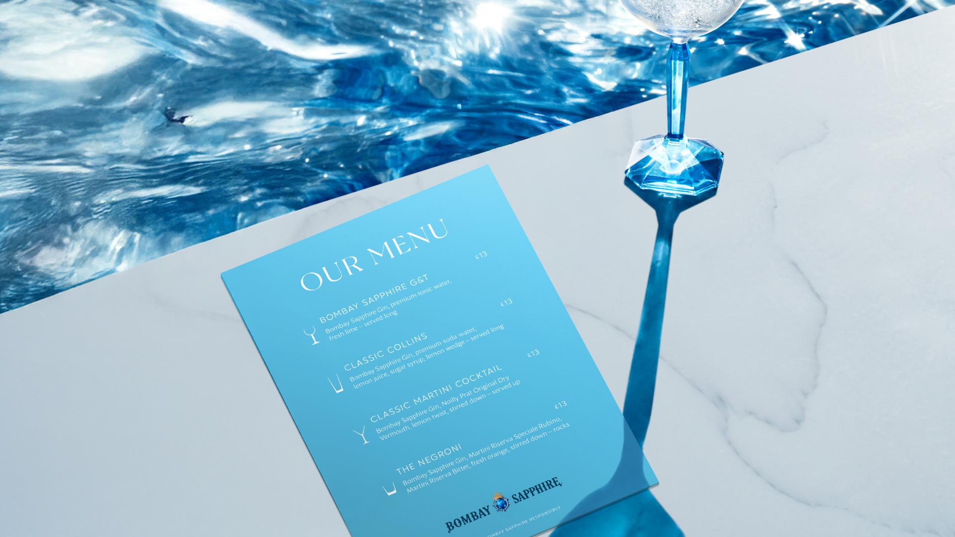
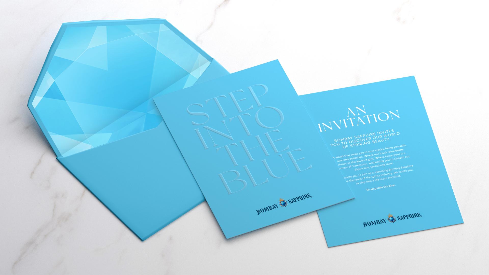
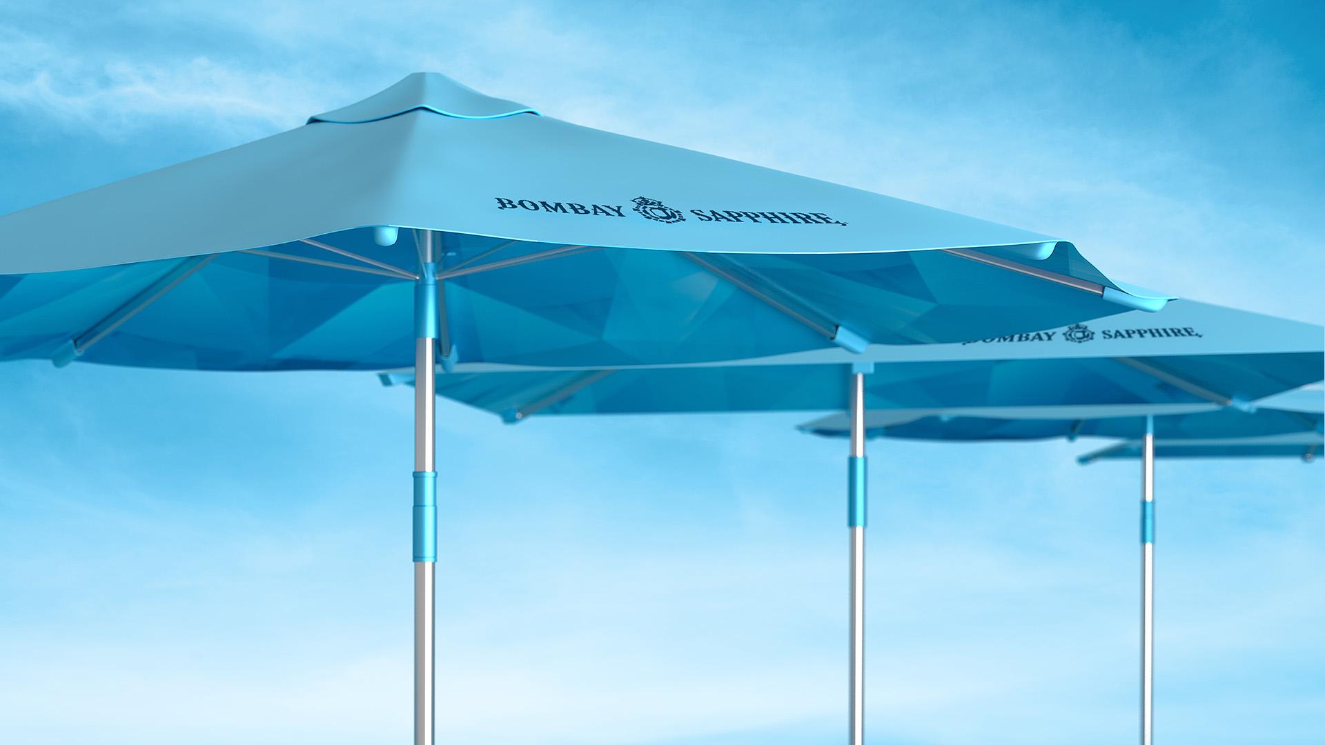
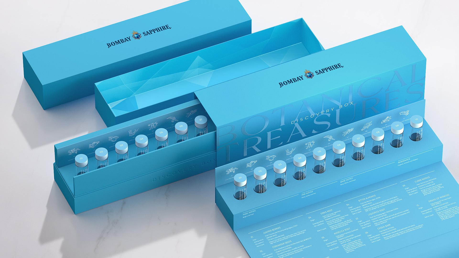
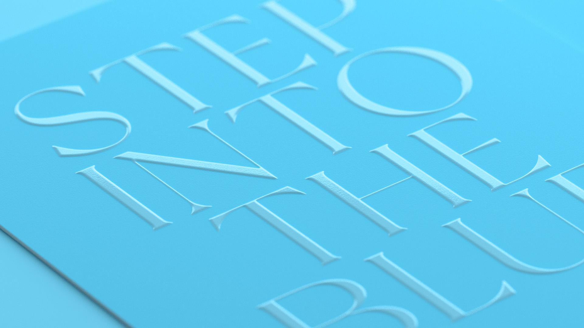
Blue became the anchor of the brand identity. Instead of treating it as a flat colour, we examined how it could vary through a dynamic blend of texture, material, finish, and lighting, adding depth while maintaining a disciplined palette. We incorporated gem-inspired structures and faceted forms to extend the language of the bottle into a repeatable environment. This enables the brand to move between bold, high-impact moments and more minimal, tactile applications without losing coherence.
Elevating assets
Several core elements were refined to enhance consistency across various outputs. The logo was recreated in CGI to better highlight its intricate metalwork, with an antique gold finish adding depth and authenticity. A custom typeface was developed to give the brand a distinct voice. Gem-inspired patterns and refined illustrations enrich the visual language and keep it effective across different formats.
Adaptability across touchpoints
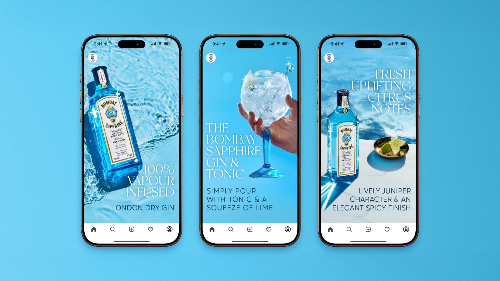
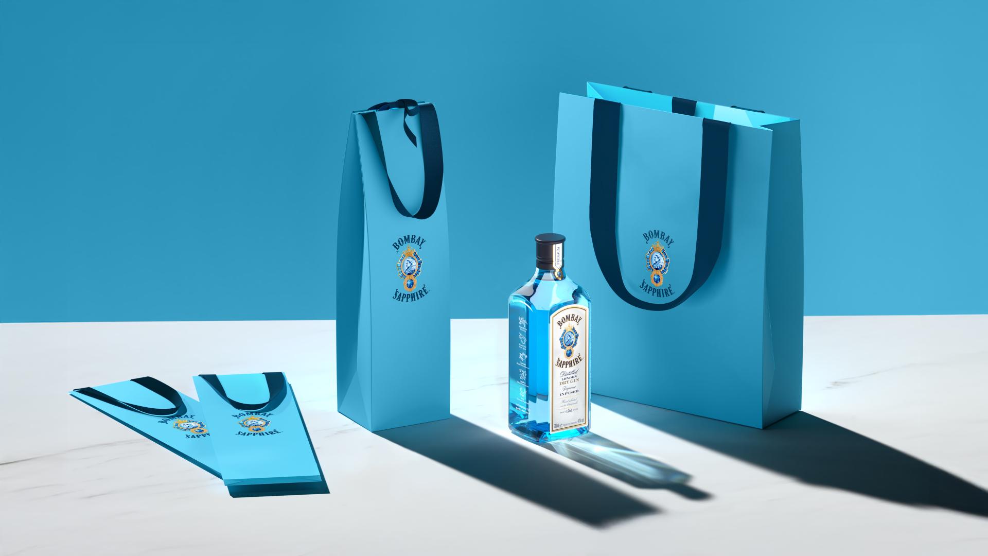
The cohesive design system and brand world we created guide everything Bombay Sapphire does across touchpoints and activations. By establishing clear guidelines for how colour, typography, patterns, and illustrations work together, the identity can be applied consistently across markets while still allowing for variations in scale and format. This evolution transforms every interaction into a seamless and immersive experience that celebrates the craftsmanship, creativity, and unique spirit behind this world-renowned gin.
Execution
The CGI logo, bespoke typography, and supporting patterns and illustrations were developed as a cohesive toolkit. The blue world was brought to life through a controlled application of texture, finish, and lighting. The result is a global system designed to deliver a striking and consistent brand presence wherever Bombay Sapphire is represented.
Featured Media

Entrant
Pure Perfection GmbH
Category
Experiential & Immersive - Business to Business
Country / Region
Germany

Entrant
Pure Perfection GmbH
Category
Experiential & Immersive - Launch Event
Country / Region
Germany
Entrant
Vidico
Category
Video - Animation
Country / Region
Australia

Entrant
CHENGDU TRY DESIGN Co., Ltd.
Category
Corporate Identity - Logos
Country / Region
China