
2020
TOFU Studio / branding
Entrant Company
TOFU Studio
Category
Corporate Identity - Logos
Client's Name
TOFU Studio
Country / Region
Poland
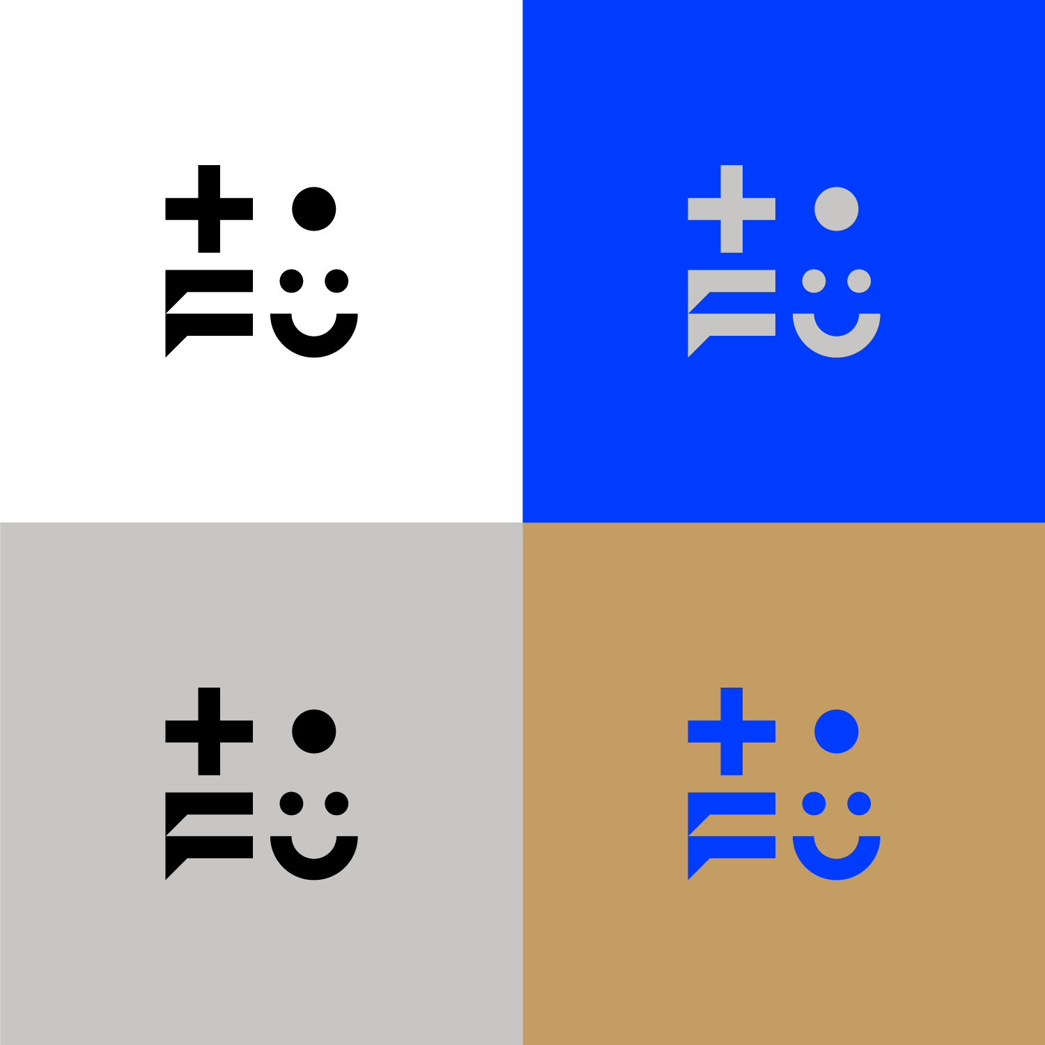
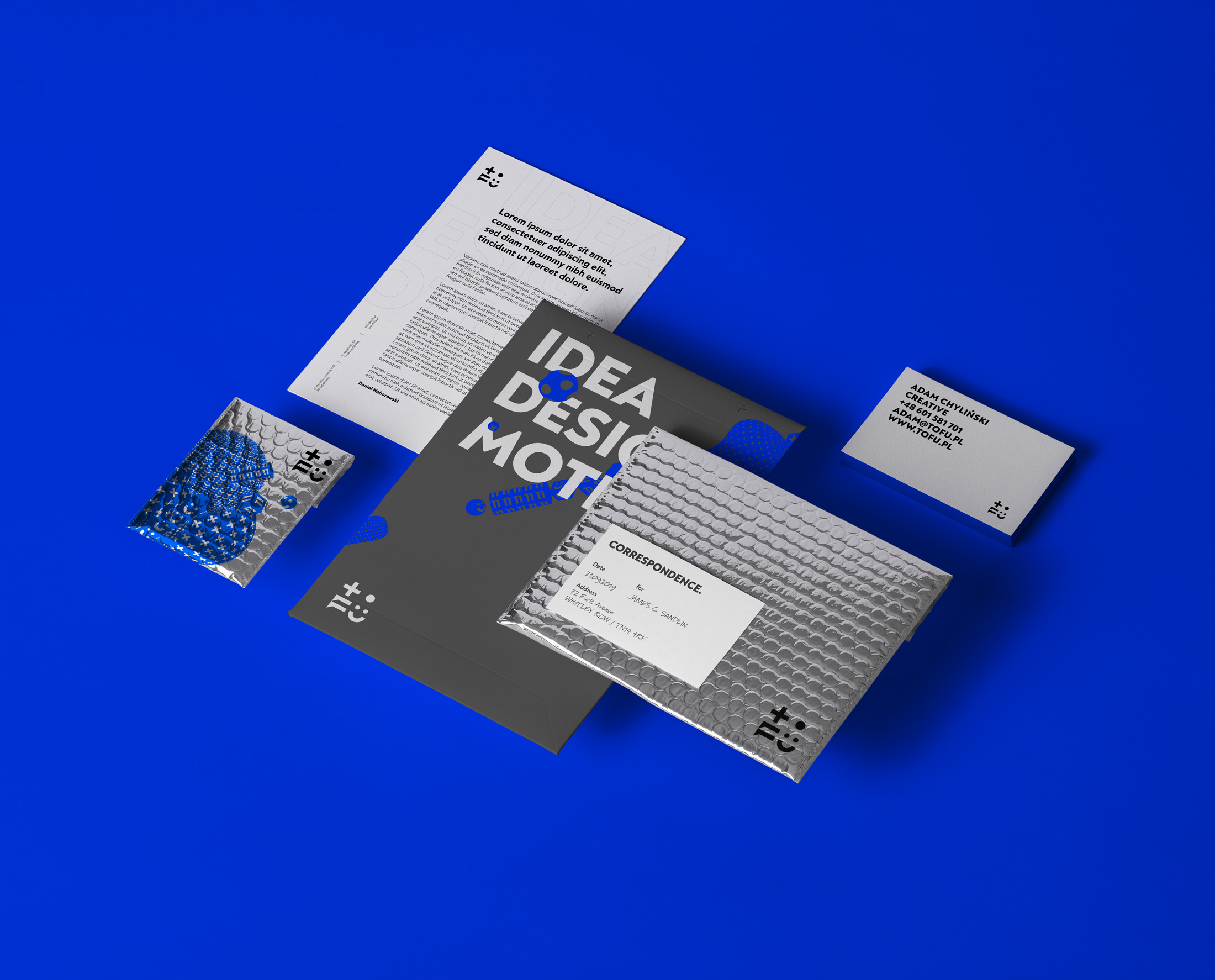
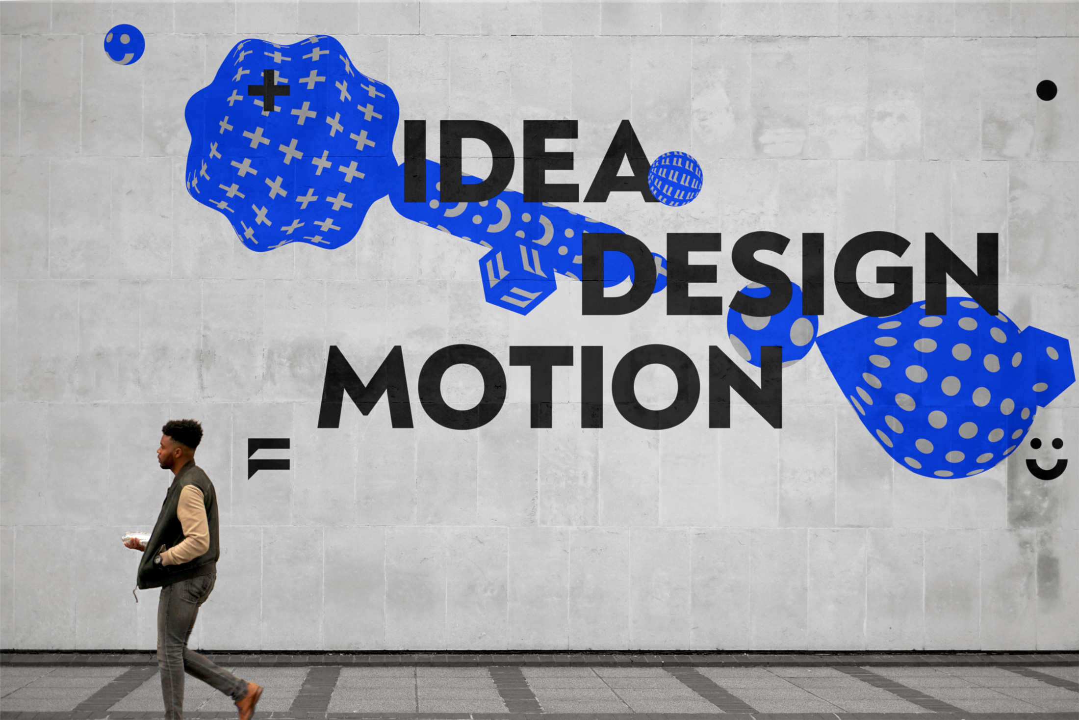
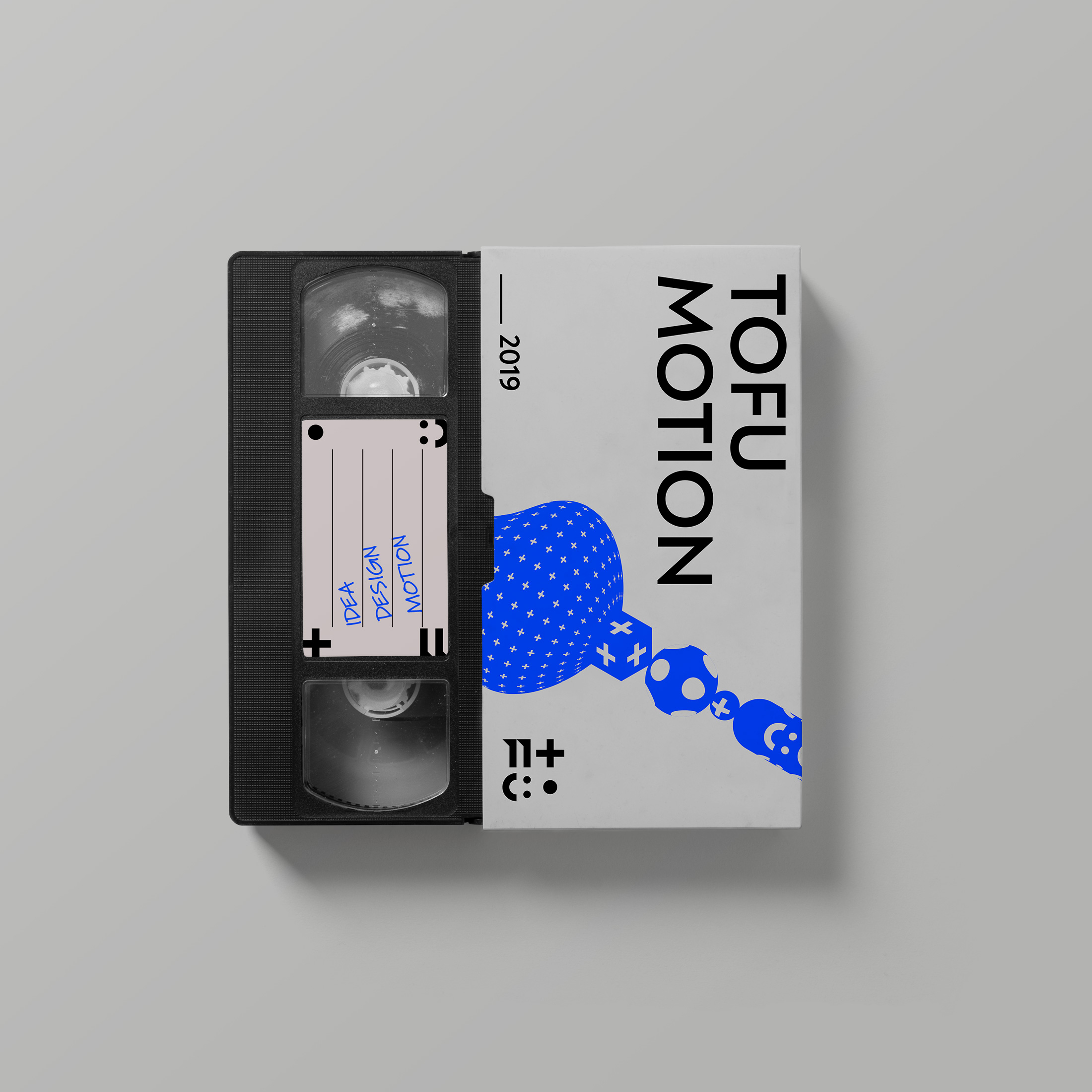
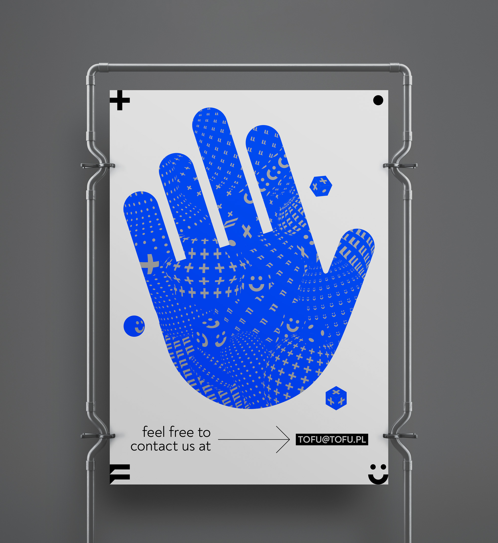
TOFU's new logo and branding is a combination of two elements - creative imagination and real craftsmanship.
As a creative, design and multidysciplinary studio we wanted to emphasize in the branding our strength creativity and the fact that we create unusual projects. On the other hand, thanks to our skills and experience, we are able to control the entire process of creation, ensuring that we can precisely respond to customer needs.
In addition, each letter also decodes the philosophy of relationships and working process on each project. (T): We are "in plus". (O): We hit "in point". (F): We are always "in touch". (U): We have finishing each project "in happiness".
On the visual sphere of branding we have illustrated these two areas with flexible key visual based on unpredictable forms in which letters from our sign are inscribed. It is represented by sophisticated and restrained typography, and simple, black and white graphic forms with a light technical note.


Credits

Entrant Company
Player One Trailers
Category
Video - Cinematography
Country / Region
United States
Entrant Company
Montenegro Design
Category
Corporate Identity - Logos
Country / Region
Brazil

Entrant Company
Player One Trailers
Category
Video - Trailers
Country / Region
United States

Entrant Company
Zgraya Digital
Category
Website - Business to Business
Country / Region
Estonia