
2026 Platinum Winner

2026
Entrant
Category
Client's Name
Country / Region





About The Entry
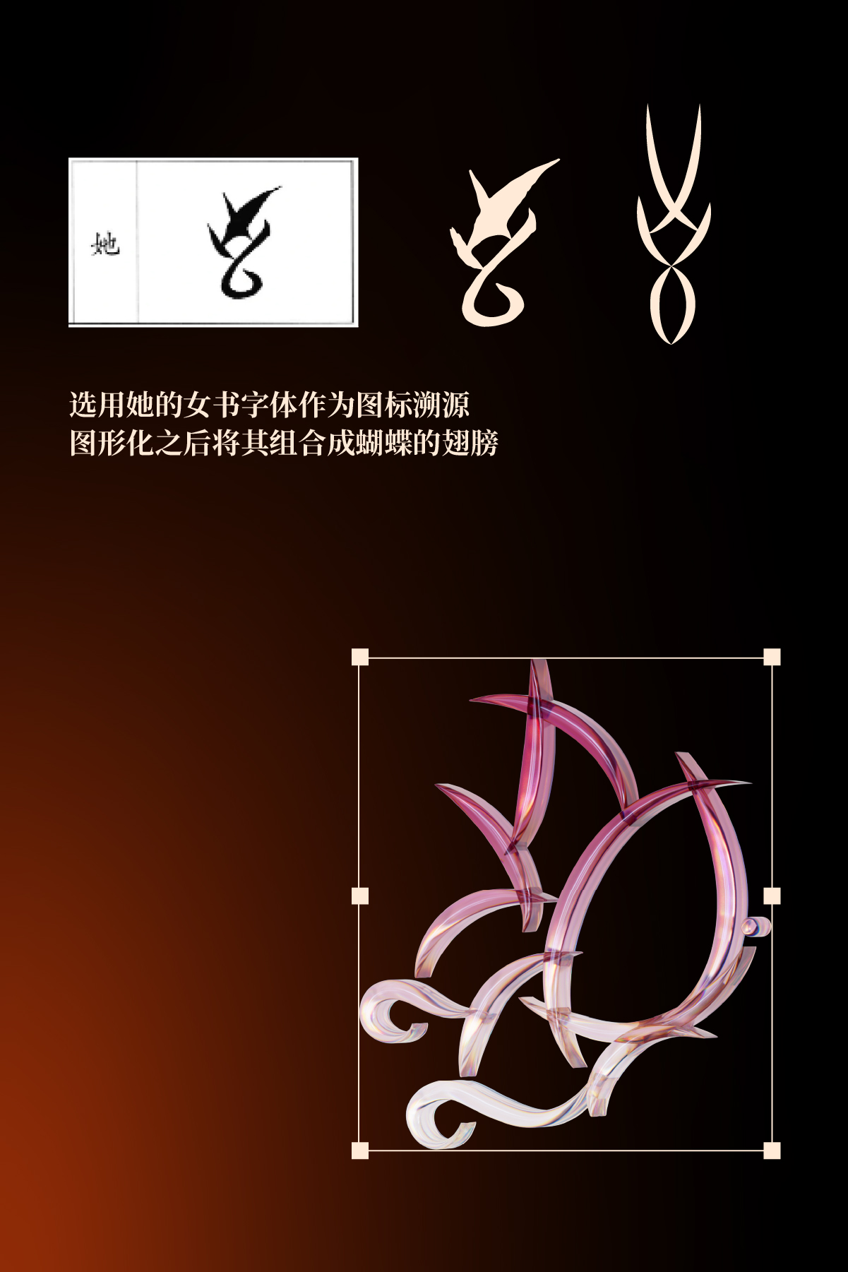
The project encompasses the design of the LOGO, main visual posters, as well as in-program entries, advertising integrations, and other packaging elements for the variety show(Sisters in Charge/Her Prime).is China’s first observational variety show themed on middle-aged women. To reflect this focus, we drew inspiration from [Nüshu script]—the first written language in Chinese history exclusively used by women. Using the character “她” (tā, “she”) from Nüshu, we created a highly recognizable “super graphic symbol”: a butterfly, which carries rich cultural connotations and emotional resonance. The Chinese font in the LOGO was then designed using the calligraphic techniques of Nüshu script.
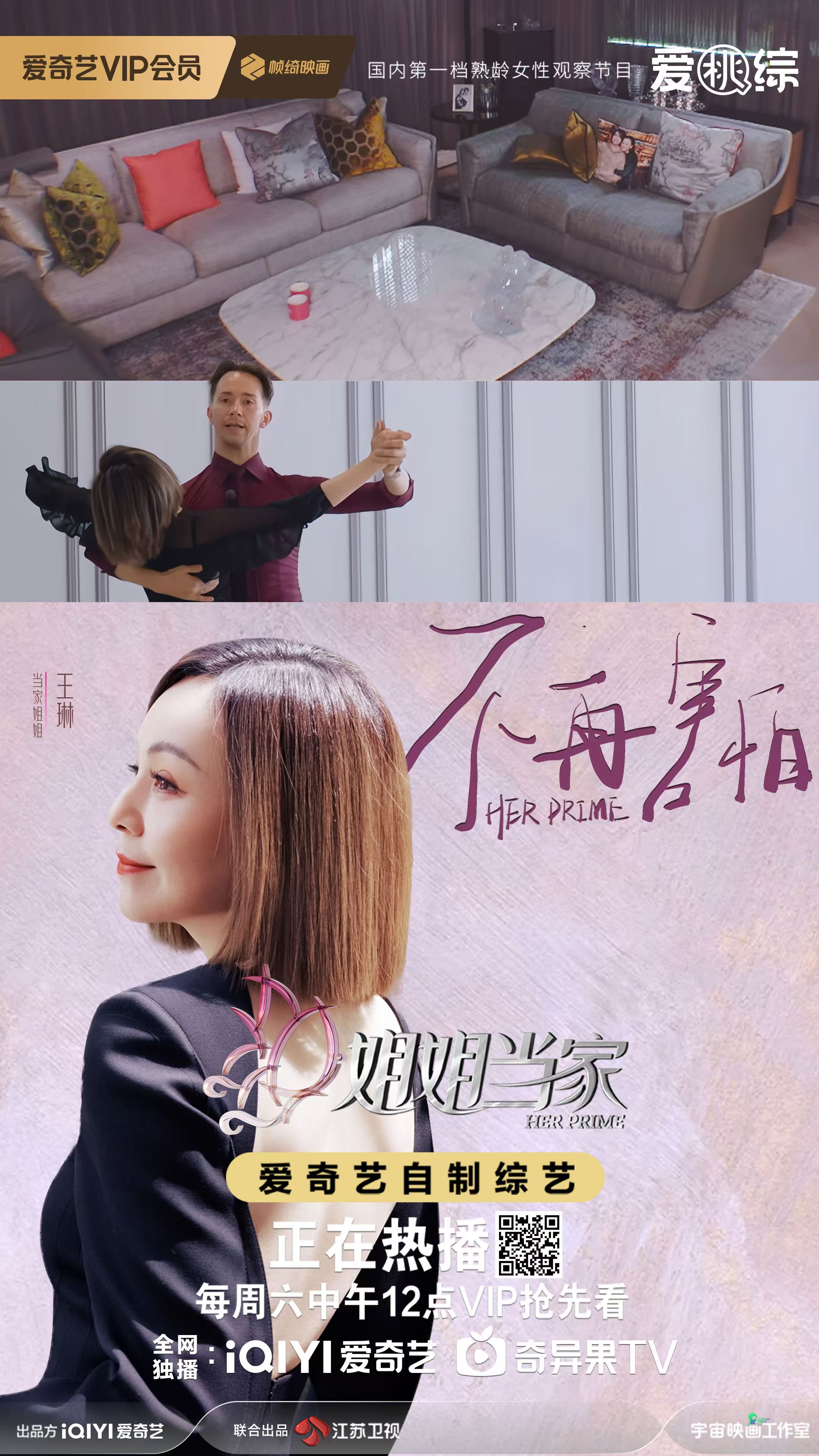
The poster design focuses on the dialogue between butterflies and women, serving as a continuation of the LOGO’s super symbol. It projects the women engaging in inner dialogues with themselves, where their small figures reflect immense inner strength and courage. For each woman in an episode, her core trait—her most distinct state, emotion, or role—is distilled into a thought-provoking “personality card.”
In terms of color application, we departed from the stereotypical sweet or gaudy female color palettes. Instead, we used black as the base tone and a more neutral red to represent mature, restrained sisters who have weathered years of life. This choice aligns with the sophisticated temperament of “mature age,” highlights the independence and strength of the “strong female lead” archetype, and avoids gender stereotypes.
2026 Platinum Winner

2026 Platinum Winner

2026 Platinum Winner

2026 Platinum Winner