
2025
Crested Ibis Flying Cup—CN-JP Art & Design Expo VI Design
Entrant Company
Feixiang Construction Group Co., Ltd. Shenyang-Liu Xinggui, Song Qinbo, Zhong Hua
Category
Corporate Identity - Brand Identity
Client's Name
Country / Region
China
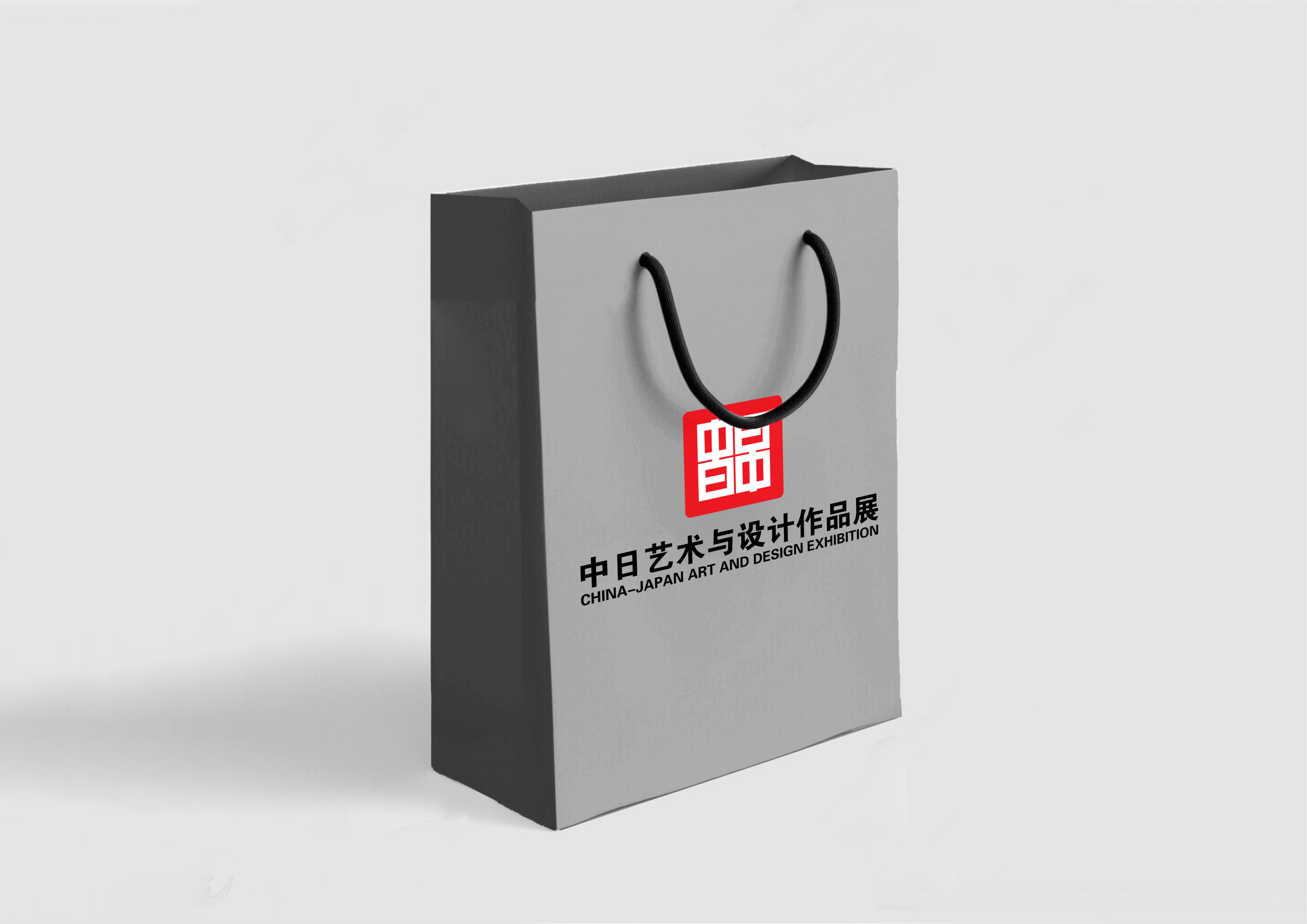
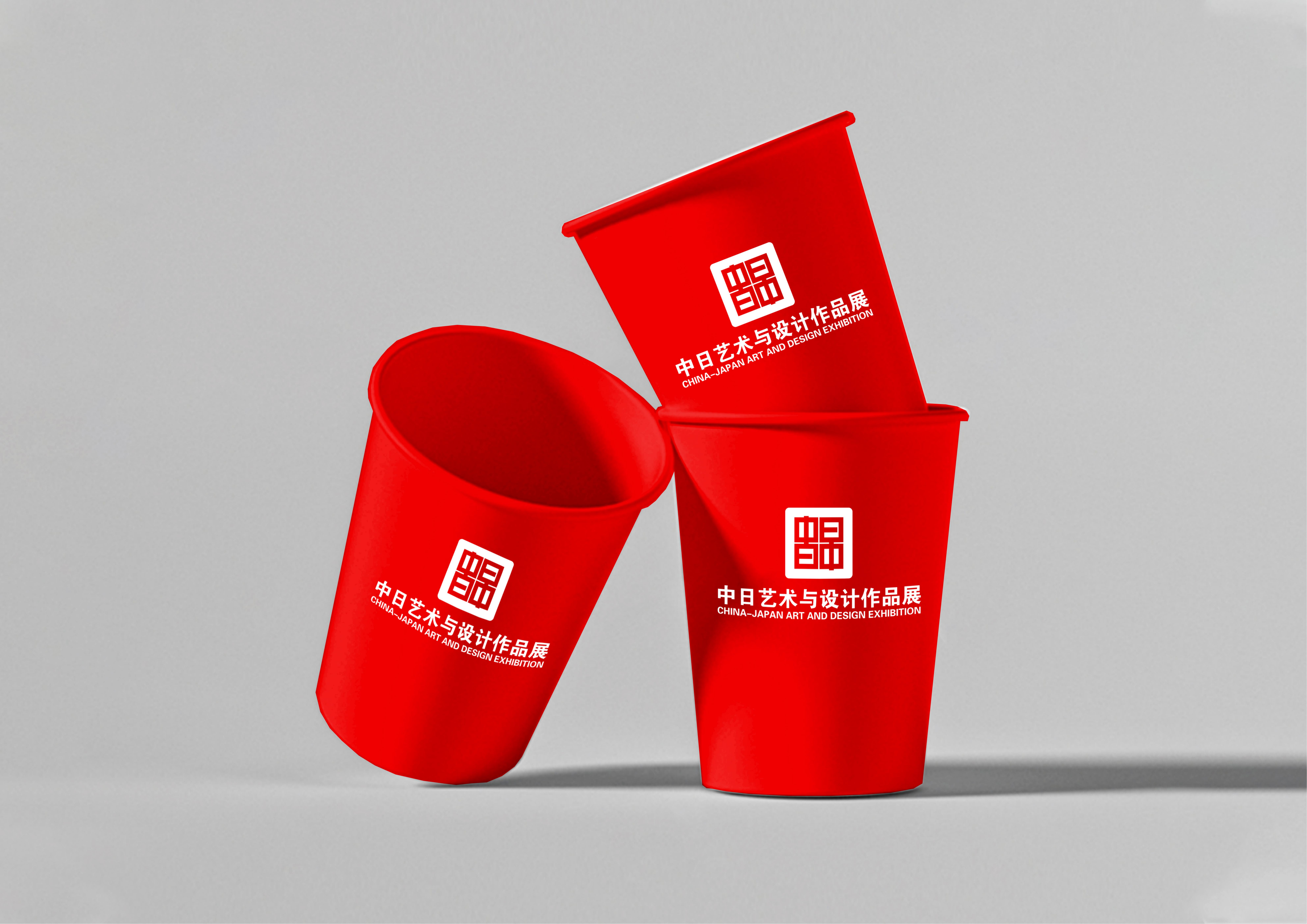
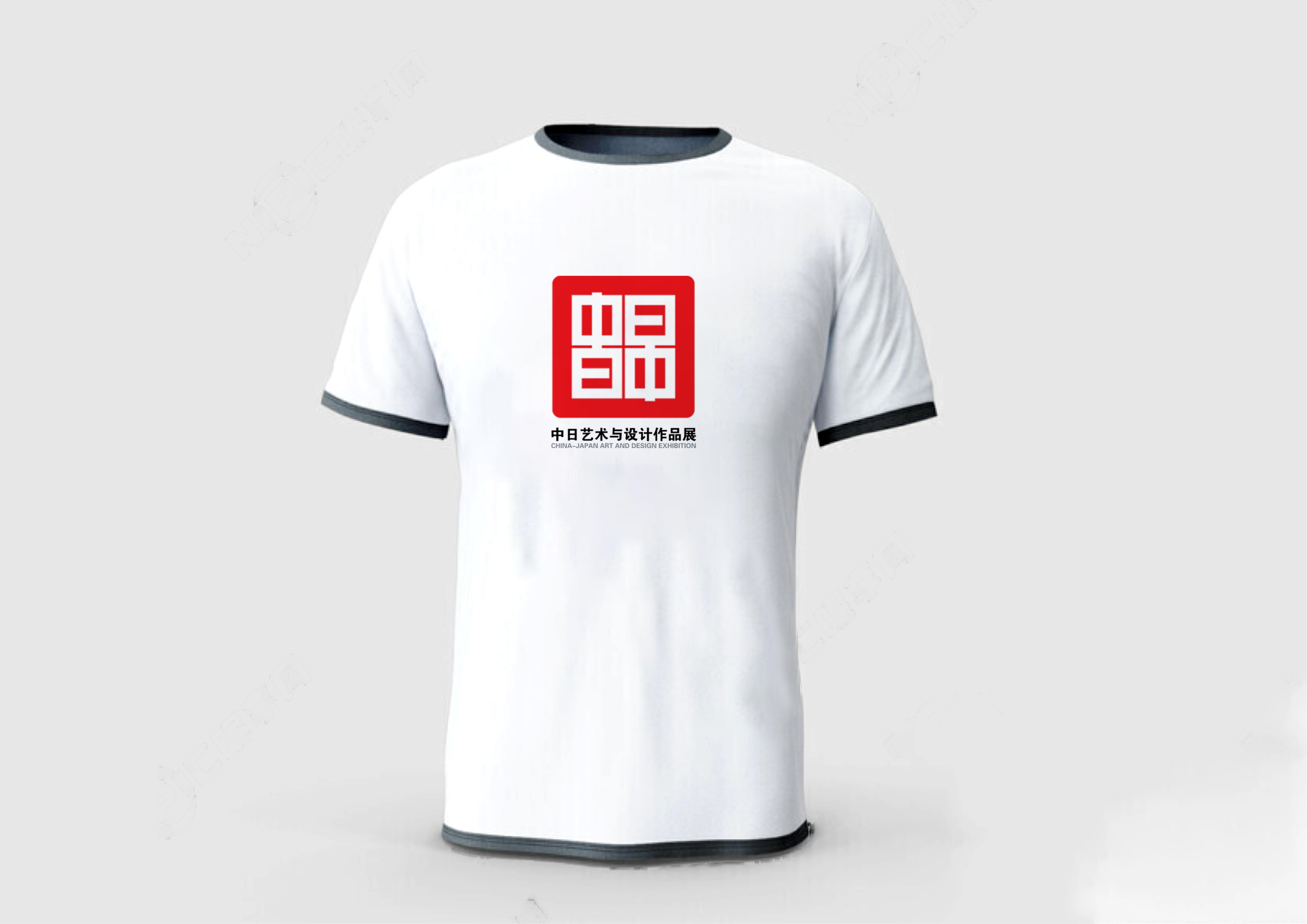
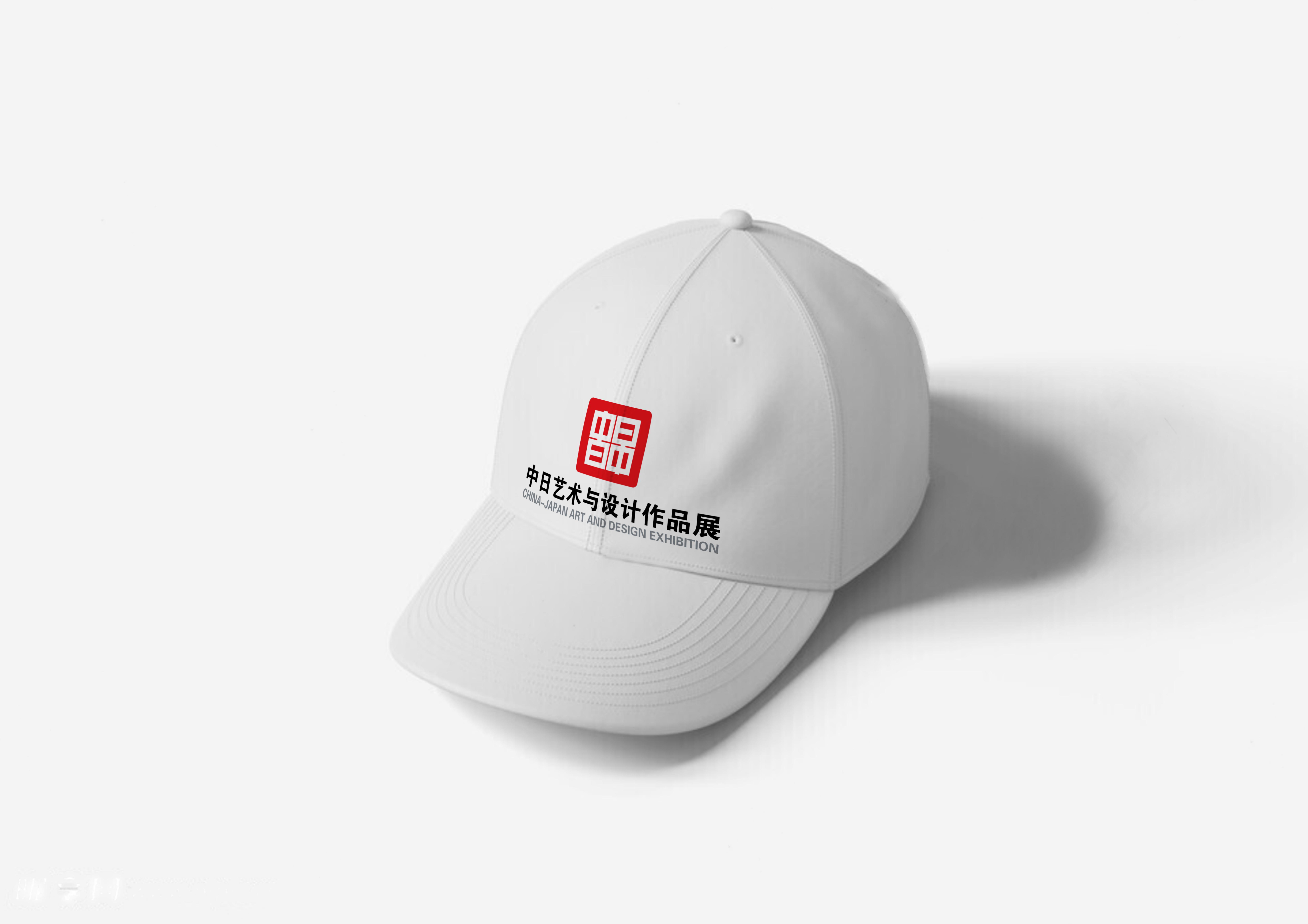
This VI visual identity system is founded on the theme of cultural symbiosis and visual dialogue, rooted in the historical connection and contemporary innovation of Chinese and Japanese art and design. It translates the exhibition spirit of communication, integration, inheritance, and innovation into a unified and recognizable visual language that reflects both tradition and modern aesthetics. At the heart of the system, the logo serves as its spiritual core. Drawing inspiration from the traditional Chinese seal, it conveys integrity, authority, and inheritance, while the square outline sets a rigorous and solemn tone suitable for the exhibition’s professional positioning. Within this framework, the creative fusion of the Chinese characters “Zhong” (China) and “Ri” (Japan) becomes the central symbol. The steady, balanced strokes of “Zhong” embody inclusiveness and cultural depth, while the asymmetrical gap of “Ri” introduces dynamism and vitality. This subtle intervention creates a spatial rhythm of virtual and real, symbolizing harmony in diversity and suggesting that dialogue thrives on difference and imagination. The result is a powerful emblem that functions as a visual bridge between two artistic traditions. To ensure consistency and adaptability, the system is supported by standardized elements. Typography combines a Chinese calligraphic style that blends traditional charm with contemporary simplicity, alongside a modern sans serif English font for bilingual clarity. The color palette is based on vermilion red, representing passion and cultural heritage, paired with Japanese paper white, symbolizing purity, and accented with dark gray for balance and visual comfort. Auxiliary graphics are derived from the distinctive gap of “Ri,” extended into irregular lines, blank spaces, and gradients that enrich layouts while reinforcing unity across applications. The identity extends seamlessly into multiple scenarios, including promotional materials, venue signage, and derivative products. Posters and invitations highlight the core logo with auxiliary graphics and standard colors, enhancing recognizability. Signage in the exhibition environment integrates seal outlines with bilingual characters to build scene memory, while cultural and creative products adapt the logo through scaling and color variations, ensuring both integrity and flexibility across media.
Credits

Entrant Company
Harajuku DESIGN Inc.
Category
Corporate Identity - Brand Identity
Country / Region
Japan
Entrant Company
Gooest Media Technology
Category
Experiential & Immersive - Live Experiences
Country / Region
China
Entrant Company
Eric Tom & Bruce
Category
Video - Children
Country / Region
Australia

Entrant Company
15|40 Productions
Category
Experiential & Immersive - Immersive Brand Experience (NEW)
Country / Region
United States