
2025
The Logo Design and Application of Enjoy Kaohsiung.
Entrant Company
Wu,Yi-Hsuan , Lin,Li-Ting , Hong,Yu-Xin
Category
Student Submission - Student Logo Design
Client's Name
NKUST Department of Cultural and Creative Industries
Country / Region
Taiwan
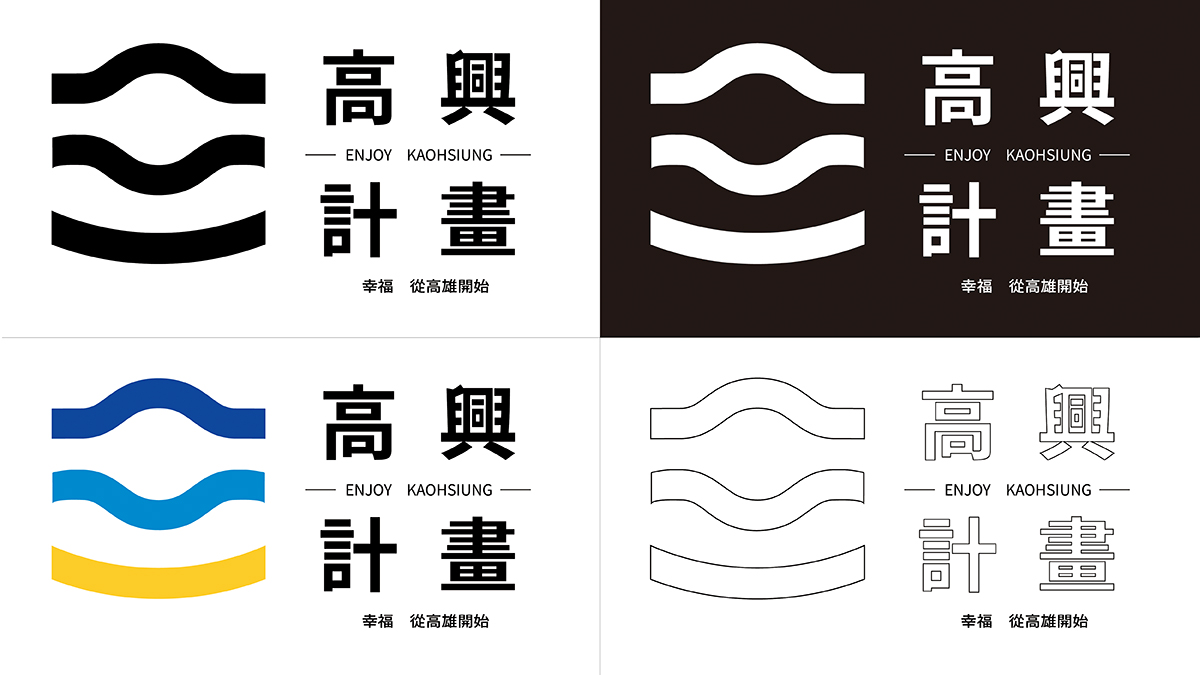
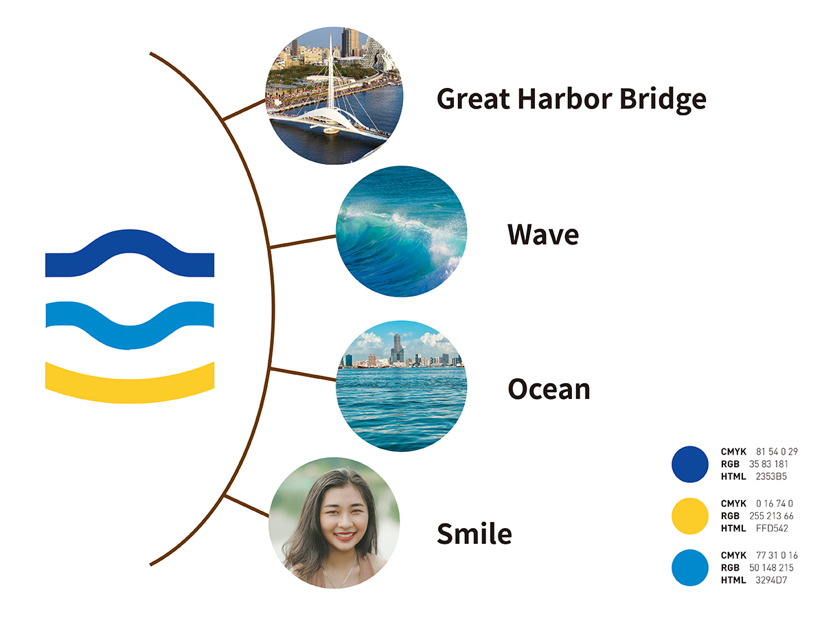
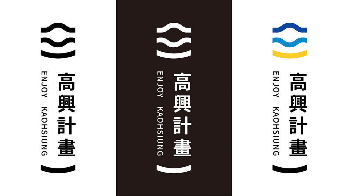
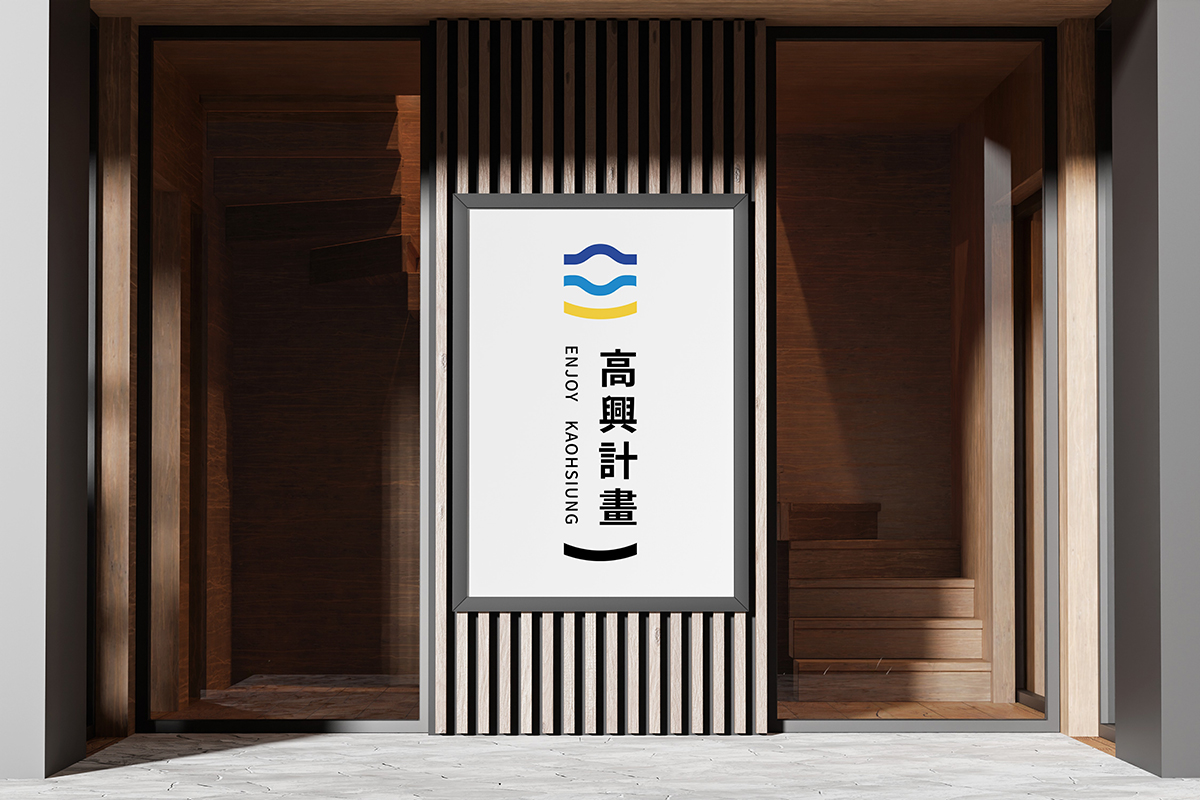
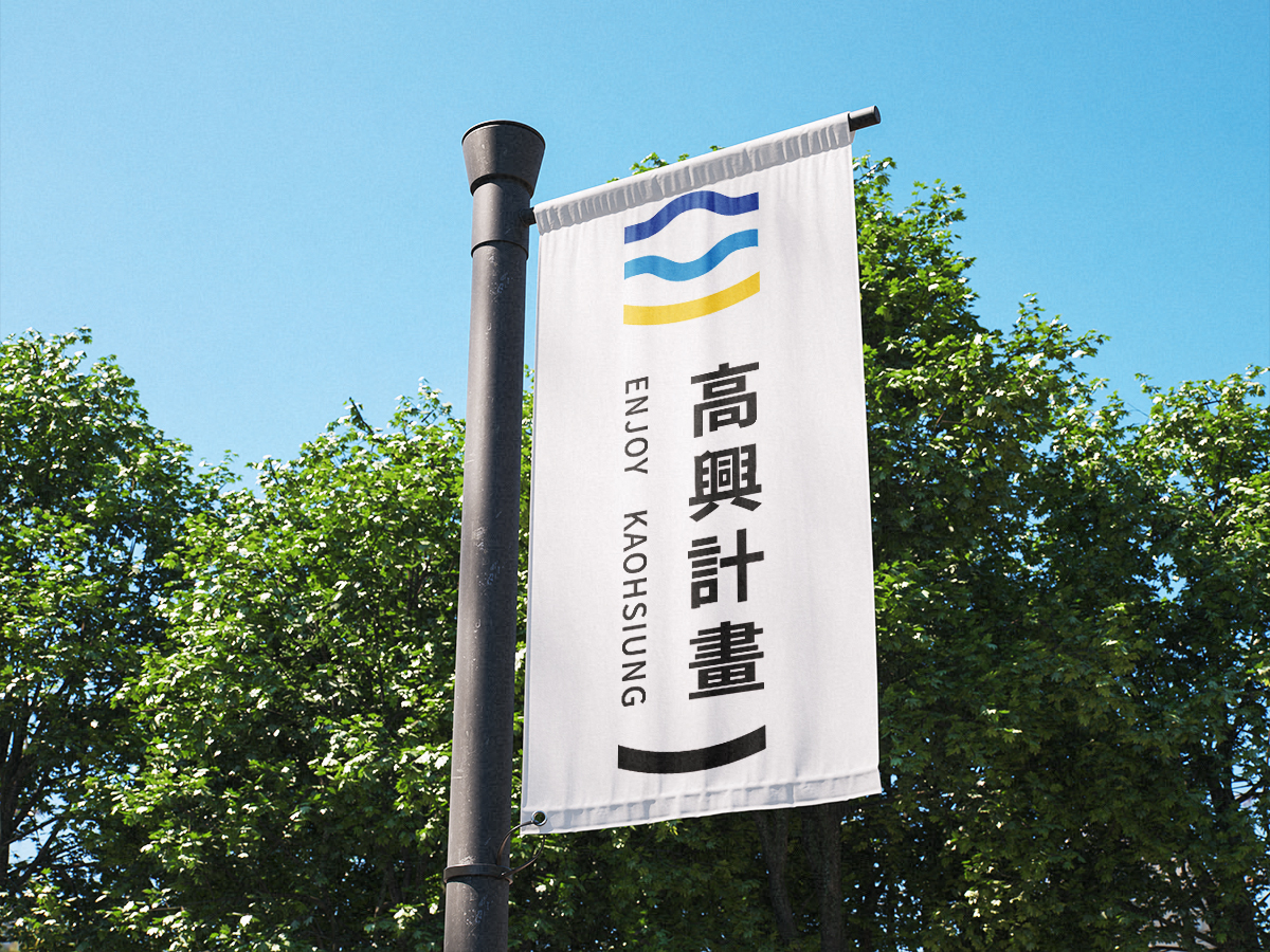
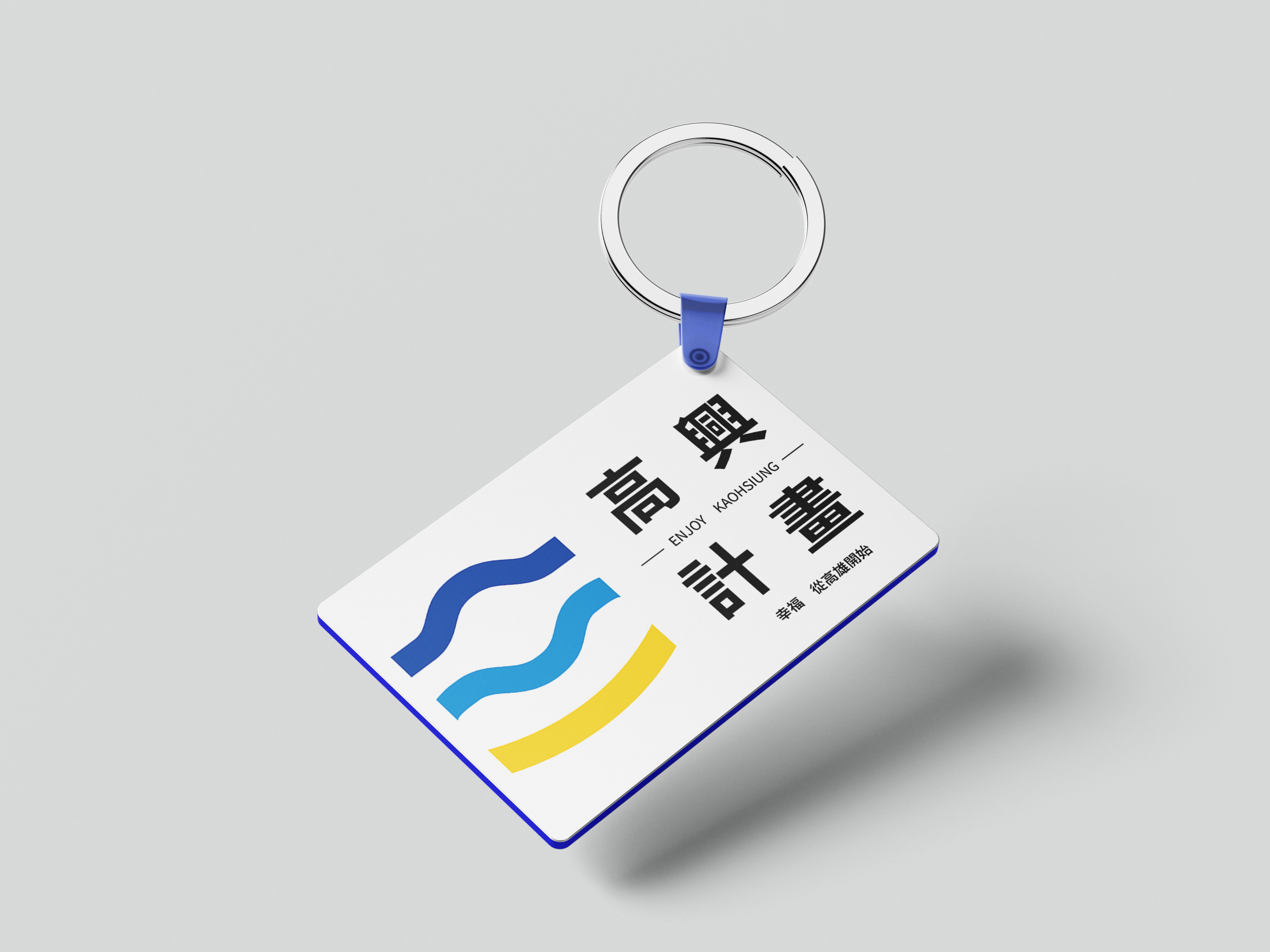
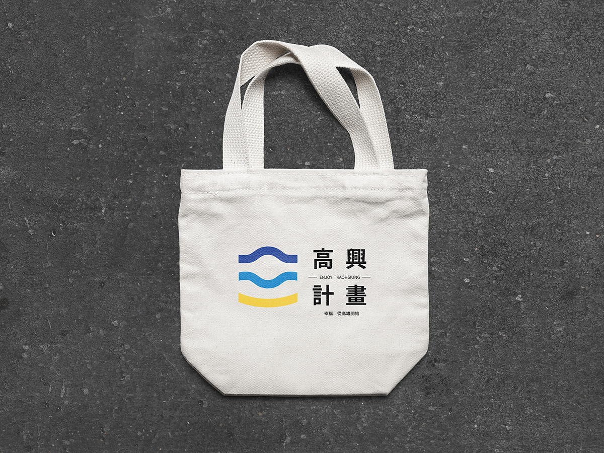
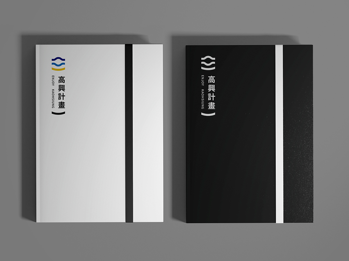
The name “Enjoy Kaohsiung” combines the goals of revitalizing Kaohsiung and bringing happiness. The logo design features a yellow sun, blue waves, and a smiling face, representing Kaohsiung’s warmth, maritime culture, and friendly atmosphere.
The yellow semi-circle sun symbolizes Kaohsiung’s sunshine and enthusiasm, conveying a sense of positivity and energy. The blue waves represent Kaohsiung’s port development, bringing a feeling of stability and relaxation while showcasing the city’s prosperity. The smiling face signifies friendliness and approachability, reflecting the warmth of Kaohsiung’s people.
In terms of color scheme, yellow represents warmth and happiness, resonating with Kaohsiung’s sunny climate and evoking a sense of vitality. Blue signifies stability and trust, ensuring visitors feel relaxed throughout their journey in Kaohsiung. The design applies color psychology and semiotics to strengthen emotional connections and enhance brand recognition.
The “Enjoy Kaohsiung” logo is not just a visual symbol but also a tangible representation of Kaohsiung’s passion, vibrancy, and vision for development, delivering a message of joy and positivity.
Credits
Entrant Company
M+C SAATCHI GROUP, Qatar
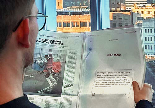
Category
Advertising - Newspaper Ad (Single)
Country / Region
Qatar

Entrant Company
AARP Brand Creative Services
Category
Marketing & Promotional - Brochure
Country / Region
United States

Entrant Company
AbelsonTaylor Group
Category
Branded Content - Healthcare & Pharma
Country / Region
United States

Entrant Company
New York Life Insurance
Category
Video - Internal Communication
Country / Region
United States