2017
Herbalife Vehicle Graphic Design
Entrant Company
Nokua Design Sdn Bhd
Category
Outdoor Advertising - Vehicle Graphics
Client's Name
Herbalife
Country / Region
Malaysia
The purpose of the design is to help promote Herbalife brand and identity.
While the use of green, black and white is to match Herbalife coporate identity, green colour also closely represent nature, freshness and health, which is similar to Herbalife identity, which is about healthy and active lifestyle. The use of black and white is to show contrast, to achieve the balance in the visual.
As for the use of wave graphic, it is because a powerful wave mean it is able to push forward regardless how strong the obstacles are, much like how Herbalife help one to achieve a healthy and confidence lifestyle, able to face everyday challenge.


Entrant Company
MicroMovie Media GmbH (GuidePilot)
Category
Mobile App - Educational Institution
Country / Region
Germany
Entrant Company
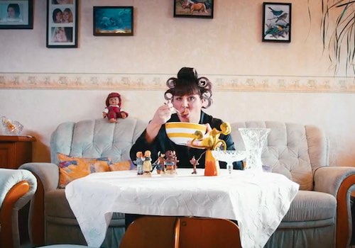
Fiction Films
Category
Video - Marketing Product & Services
Country / Region
Germany
Entrant Company
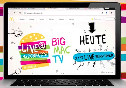
SevenOne AdFactory
Category
Video - Other ___
Country / Region
Germany
Entrant Company
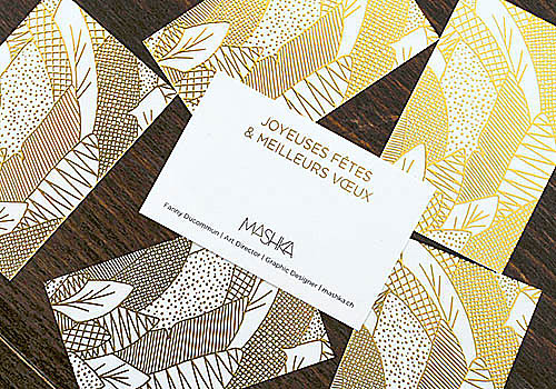
Mashka
Category
Marketing Branding & Design - Invitation / Greeting Card
Country / Region
Switzerland